Edward Winter
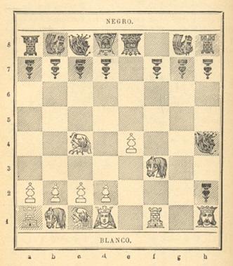
C.N. 2916 raised the subject of unusually ornate diagrams and mentioned a nineteenth-century edition of Philidor’s Análisis del juego de ajedrez:
We welcome not only similar specimens but also sightings of the unsightly, i.e. anything worse than the following, from page 87 of Schachkuriosa by Helmut Swoboda (Zurich, 1965):
(4317)
From page 3 of the Chess Player’s Chronicle, 10 June 1885:
‘Novel Chess Board. The South Australian Chronicle thus describes a board designed by Mr W. Braddock, and especially intended for beginners:
“The squares are marked out in the ordinary way, but instead of the dark colored ones being definitely red or black, each contains a complete diagram of the chess board, with the position of the men after the fifth move in some regular opening. Thus there are 32 of the principal openings represented. The designer has been very careful in omitting obsolete and notoriously unsound debuts, and he has done well in showing two or three variations in the more popular gambits, such as the Evans or the King’s. The board will be exceedingly useful as an aid to study.”’
(4578)
It was commented in C.N. 4389 that chessboards with a black square at h1 are too frequent an occurrence to be noteworthy, but how often has the mistake happened on the front cover of a chess book? The only instance that comes to our mind is ¿Quiere usted aprender á jugar al ajedrez?, an anonymous, undated volume published in Barcelona in the Willemanns collection:
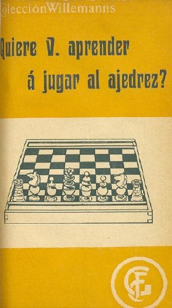
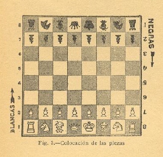
The faulty picture also appeared on page 8, but the text itself indicated that h1 should be a white square. However, the book’s only diagram with pieces was the following (on page 12):
(4643)
From Chris Ravilious (Eastbourne, England):
‘By coincidence, the subject of chess book covers with a black square at h1 received a brief mention on page 38 of the October 2006 issue of CHESS. The three books mentioned there are Morphy’s Games of Chess (the Löwenthal edition of 1860), Bird’s Chess Masterpieces (1875) and F.V. Morley’s My one Contribution to Chess (1947). John Sexton’s suggested explanation for these oddities, that they arose through a misapplication of standard black-on-white print technology to the gilt inlay used on these book covers, is almost certainly correct. There may well be other examples.’
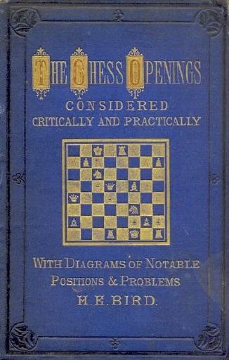
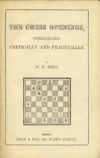
Looking further into the matter, we note that gilt inlay often resulted in the board error. For example, it occurred in subsequent editions of the Löwenthal book, including, even, the 1985 Batsford reprint. It is also worth comparing the front cover and the title page of another book by Bird, The Chess Openings, Considered Critically and Practically (London, 1878):
Further cases of a dark h1 square on front covers using gilt inlay include Chess: Its Theory and Practice by Captain Crawley, The Book of Chess by George H. Selkirk and Traité-manuel des échecs by Henri Delaire.
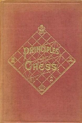
Another cover oddity concerns books by James Mason (The Art of Chess, The Principles of Chess and Social Chess). They had a 7x7 chessboard:
(4651)
Further to the reference in C.N. 7466 to the ‘board problem’, a far rarer occurrence is an inverted diagram in a book. An example comes from page 174 of Il mio amico Karpov by D. Bjelica (Abano Terme, 1981):
The position (after 21 Nxd6) was correct in the original edition; see page 252 of Rekao mi je Anatolij Karpov (Belgrade, 1981).
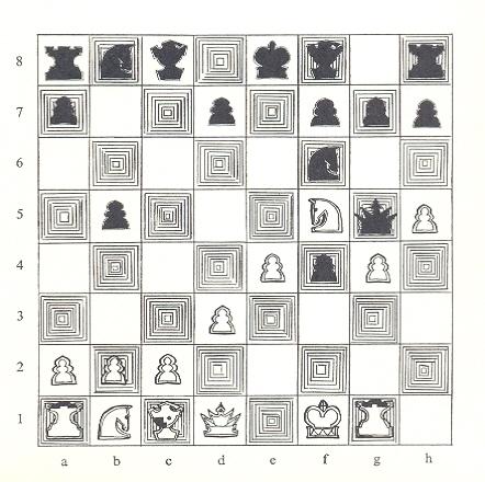
As shown above, the Italian book also had ‘inverted figurines’ (i.e. knights and bishops). These were also used, in game-scores and diagrams, in Chequers Chess Publication volumes of the 1980s. The example below is in a game between Kasparov and Nunn, from page 171 of The Brussels Encounter by W. Hartston, W. Iclicki and R. Lancaster (London, 1987):
On page 426 of the 30 July 1955 CHESS an unnamed customer complained about a celluloid chess-set in which the knights faced to the right. In the 30 September 1955 issue (page 454) a reader, W.H. Duce, commented: ‘In the cardboard chessmen of the Portland sets the king’s knight faces left but the queen’s knight faces right ...’ See also page 27 of the January 1987 BCM and page 120 of the March 1987 issue.
(7474)
Javier Asturiano Molina (Murcia, Spain) has provided this magazine cover:
See Gaffes by Chess Publishers and Authors.
From page 10 of the Daily Express, 17 February 1930:
Alan O’Brien (Mitcham, England) asks for information about a product advertised on page xi of the September 1985 BCM:
(6220)
In 2006 there was an edition of Chess Fundamentals revised by Nick de Firmian which purported to improve on the text by giving the reader less Capablanca and more de Firmian.
Now, Emereo Publishing has brought out ‘The original classic edition’ of Capablanca’s work:
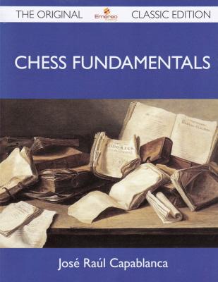
All the diagrams have been dropped, and the book is therefore unusable. For instance:
(7756)
Javier Asturiano Molina notes the title page of The Neo-Sveshnikov by Jeremy Silman (Moon Township, 1991):
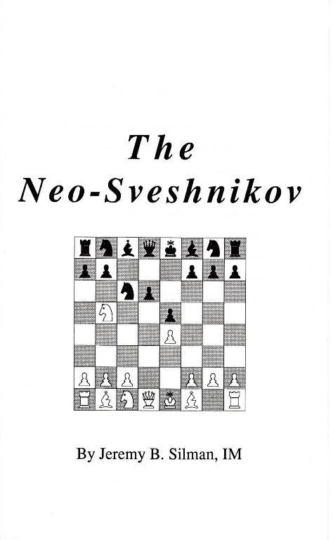
(8874)
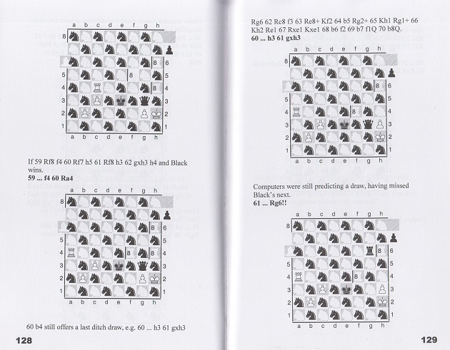
Above are pages 128-129 of Magnus Carlsen – Viswanathan Anand 2014 Re-Match for the World Chess Championship by Raymond Keene (Bronx, 2014).
The book has well over 100 similar diagrams.
(9046)
A bonus example, from page 190:
Much of the book duplicates (except that 116 diagrams in that section are now dominated by black knights) what had already appeared in Raymond Keene’s book from the same ‘publisher’, Ishi Press International, on the 2013 match between Carlsen and Anand. Below, for instance, is the entire chess content on, respectively, pages 225 and 157 of the books on the 2013 and 2014 matches:


To the Archives
for other feature articles.
Copyright Edward Winter. All rights reserved.